Elev8 Chiropractic Website Review
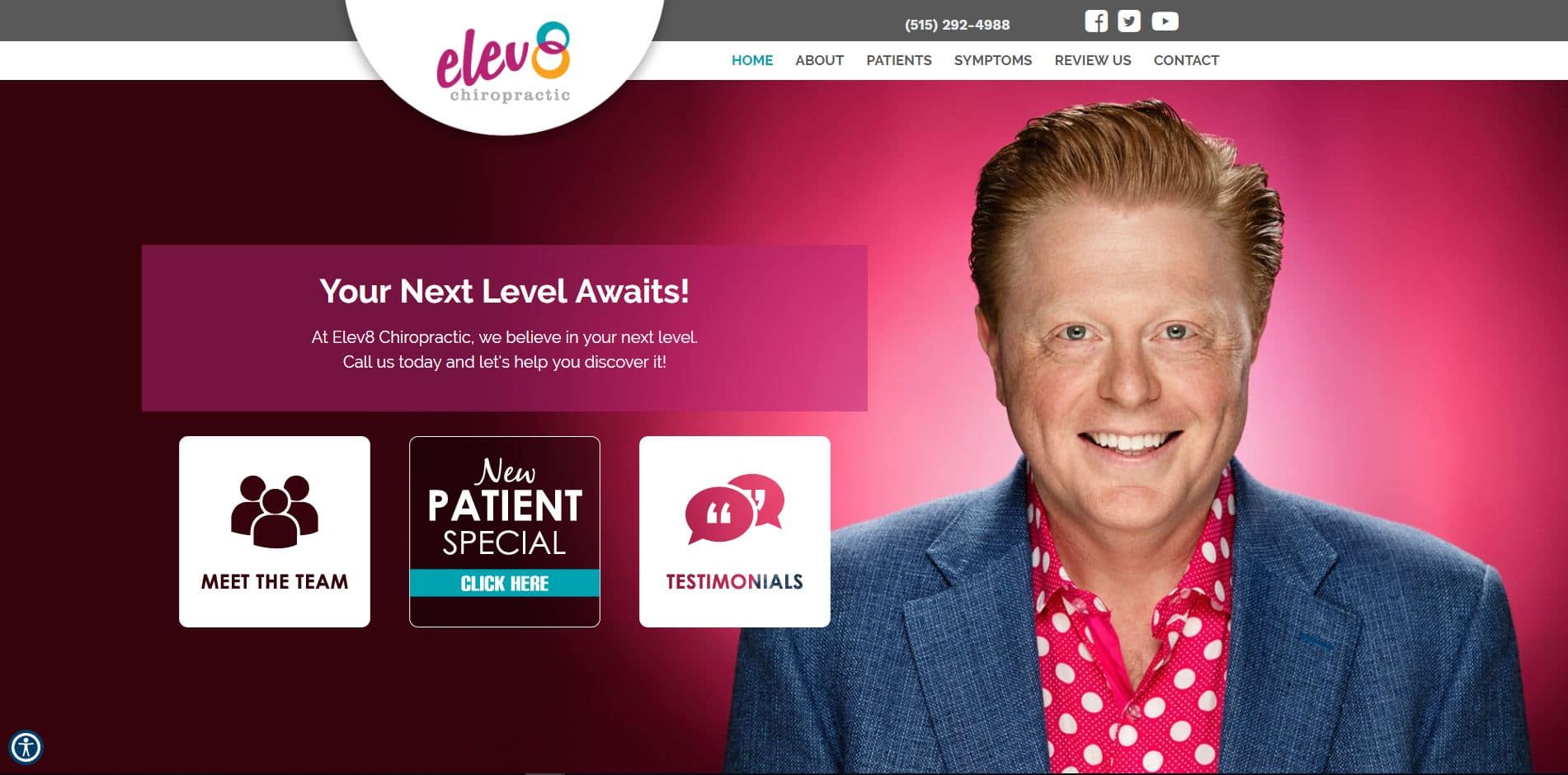
This website really stands out in a crowd. The bright, vibrant colors work so well with the great picture of Dr. Davis. If this doesn’t send a message of Know, Like and Trust I don’t know what does. This chiropractic website will always be a great performer and will continue that trend in 2019.
Overview of the Design
This design is simple, straightforward and super clean. Everything that a potential patient needs to see before they make a decision can be found without even scrolling or clicking on anything. Of course, there is a ton of supporting information within the site should someone want to read up on a specific service or symptom but very few people ever make it to the internal pages of the website.
When creating a design you must look at it from a patient’s point of view rather than your own. You want to tell them all about what you do in your office but they are rarely interested in that. The fact that they searched for a chiropractor already means that they believe you can help them. They just want to get a feeling for who you are. It’s that simple!
Use of Colors
While the colors of this website certainly grab your attention, this design wouldn’t be as successful as it is without a great picture of the doctor. Our design team often gets inspiration for colors from the pictures that a client provides. In this case, Dr. Davis’ shirt gave them a lot to work with.
Analysis of Design Elements
By placing the doctor’s picture front and center and providing a clear call to action, this design goes a long way toward giving a potential patient what they are looking for right off the bat. The menu is user friendly and the phone number and social media icons are right at the top of the page where you would expect them to be. People get quickly frustrated when they can’t find what they are looking for on a website. We don’t want to give them any reason to head back to their search result and choose someone else to work with.
Marketing Aspect
A clear call to action is an integral part of a website but unfortunately it is something that is overlooked quite often. The purpose of the New Patient Special button is to invite someone to fill out a form and submit their information to your office. It is no longer enough to have your phone number displayed because people are less likely to pick up the phone than ever before. By missing this element, you could potentially be losing out on business every single day.
Image the Website Reflects
At first glance this website reflects a fun and playful attitude. But subconsciously it gives a feeling of confidence from the doctor. He wouldn’t draw attention to himself with the bright colored shirt if he wasn’t totally secure in the fact that he was an expert in the field of chiropractic. This feeling of strength just sends one more signal that someone is looking for before making a decision.


